About Access bank
Access Bank today is Nigeria’s largest bank and Africa’s leading bank by customer base. It is a full-service commercial bank operating through a network of over 600 branches and service outlets, spanning three continents, 12 countries, and 29 million customers. The Bank has 28,000 thousand employers in its operations in Nigeria, Sub Saharan Africa, and the United Kingdom, with representative offices in China, Lebanon, India, and the UAE. It continues to look at opportunities to build its network in global trade and payment centers, helping Africa to play its part on the world stage. Additionally, the bank successfully completed its merger with Diamond Bank (a big commercial bank in Nigeria) in March 2019.
Why Access bank app?
In 2016, during my National youth service corps Program, I was opportune to open an Access bank account as a means of receiving my monthly allowances from the government, but, there was a halt to my active usage of the bank after the program, as another Bank holds my main transactions.
However, this year, I received a series of calls from the bank’s customer care representatives persuading me to return as an active customer, which is why I decided to split my savings and move some to my Access bank account. Furthermore, after going through various processes to retrieve my account number, I downloaded the Access bank app and was let down by the usability of the App.
Navigating through the App was a lot of hassle and I needed to go back to the app store to check the reviews for the app, and I actually saw some negative reviews, most of which were based on usability. These made me pause my interest in using the Bank.
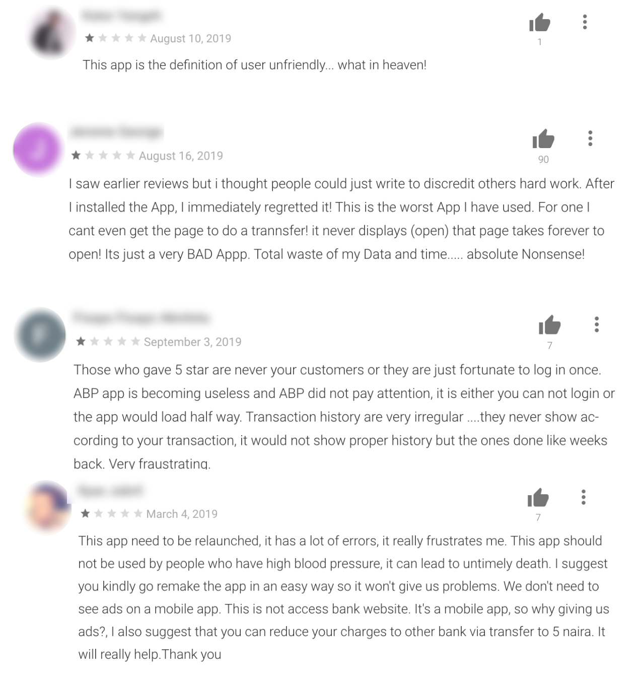
Reviews from Playstore
However, I had a rethink about not using the bank, and I decided to seize the medium to discover some usability issues in the Access bank’s application.
Overview
My Goal
My goals are
- Identify usability issues through user research
- Create and validate design solutions
- Improve usability and make the app more user-friendly.
- Improve users’ trust for Access Bank.
- Discover more about banking generally
- Communicate my design process

MY Design Process
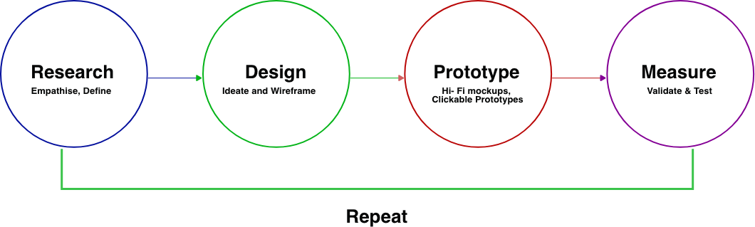
Research
Getting Started
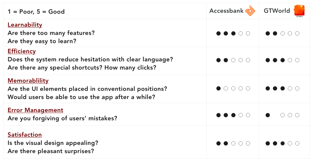
For more insights, I used the LEMERS UX evaluation method to evaluate the Access bank mobile app and Guaranty Trust Bank’s GT world app to see how both fair together.
Competitive Analysis
Access Bank as a commercial bank in Nigeria has many popular competitors that are trying to be better than they are. This is why, to begin my research, I looked at a few competitors to see where Access stood relative to them. I analyzed their UI, UX, Information architecture, User Flow and general banking features.
User Cases
I tried to create different scenarios users find themselves to make use of banking apps, you know, just to understand their reasons and desired outcome.
1- My airtime just finished, I need to recharge on my bank app, So I can call my cab driver to pick me up
2- My brother just called he needs some cash, Let me quickly login to my bank app and send him some cash, So he won’t be stranded
User Interview
To understand users’ issues and pain points with the banking app, I needed to see things from their perspective. So, I interviewed some Access bank users at work. I asked them basic questions and I required them to perform some tasks on the app, based on my understanding of general basic banking engagement.
To perform transactional tasks, I had to assure them I was going to refund any cost. Furthermore, I tried to get feedback from users based on their overall feel of the app and also based on the task given to them, which I highlighted below.
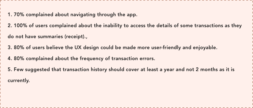
- Many users are fed up with the banking app due to frequent transactional errors.
- It’s hard for users to login using fingerprints.
- Navigating around the app is not tidy for users.
- Users prefer to use the USSD codes for small transactions and going to the banking hall for other transactions rather than using the App.

I could resonate with their thoughts as I faced similar issues navigating the app. It is either I am not allowed to log in or going back actually means pulling out the side drawer.
Like a User said in the review and i quote

After the interview was done, I referenced my notes from the interviews and tests and discovered that the major expectations of users from an app like Access bank were:
- How efficient it is. Is navigating between pages and actions easy, with no communication gap?
- It’s a banking app, can they have easy control of it? Logging in and out should be easy for them.
- Feedback is key. Users want to easily track their transaction history and manage their spending and income
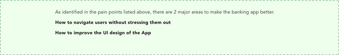
Pain points
After coupling the information from the user interview with my assumptions, I was able to find the major and minor pain points.
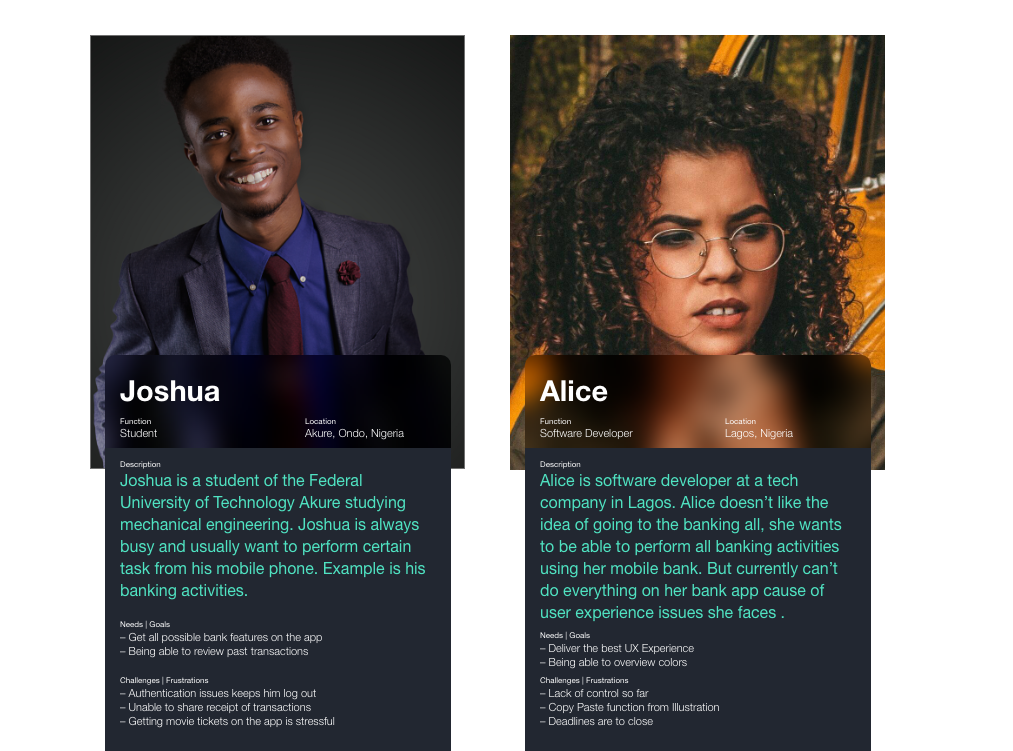
Who i will be designing for?
Using the research carried out, i drew up two personas that have different needs and different goals.
Solutions
Major Focus

Ideation
With the pain points defined, it was necessary to change the user journey for the banking app.
While researching the app I figured out some hidden and under-utilized basic features, and decided to make them better. This helped with creating the information architecture of the app. The important menus were selected and arranged in order of importance. This laid the foundation of the design process and helped me to create a user journey.
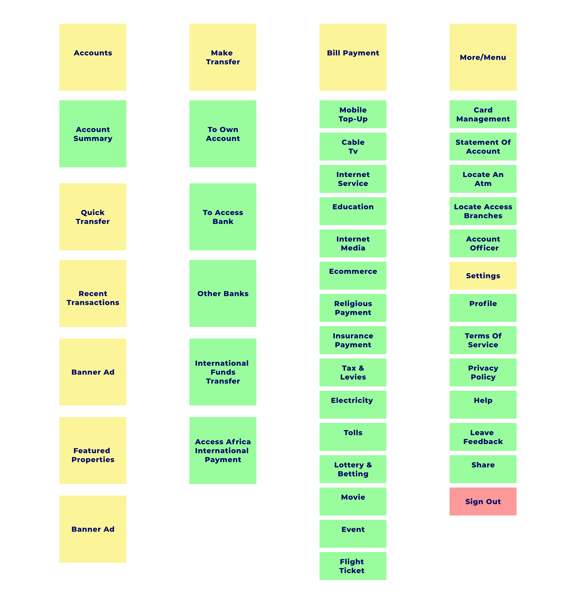
Information Architecture
Using the information architecture, i mapped out the basic flow of the app to figure each step a user takes when using the app.
Sketching the Solutions
The first thing I did was to draw out my plans on paper. This helped me to outline the app and confirm my understanding of the app and user journey.
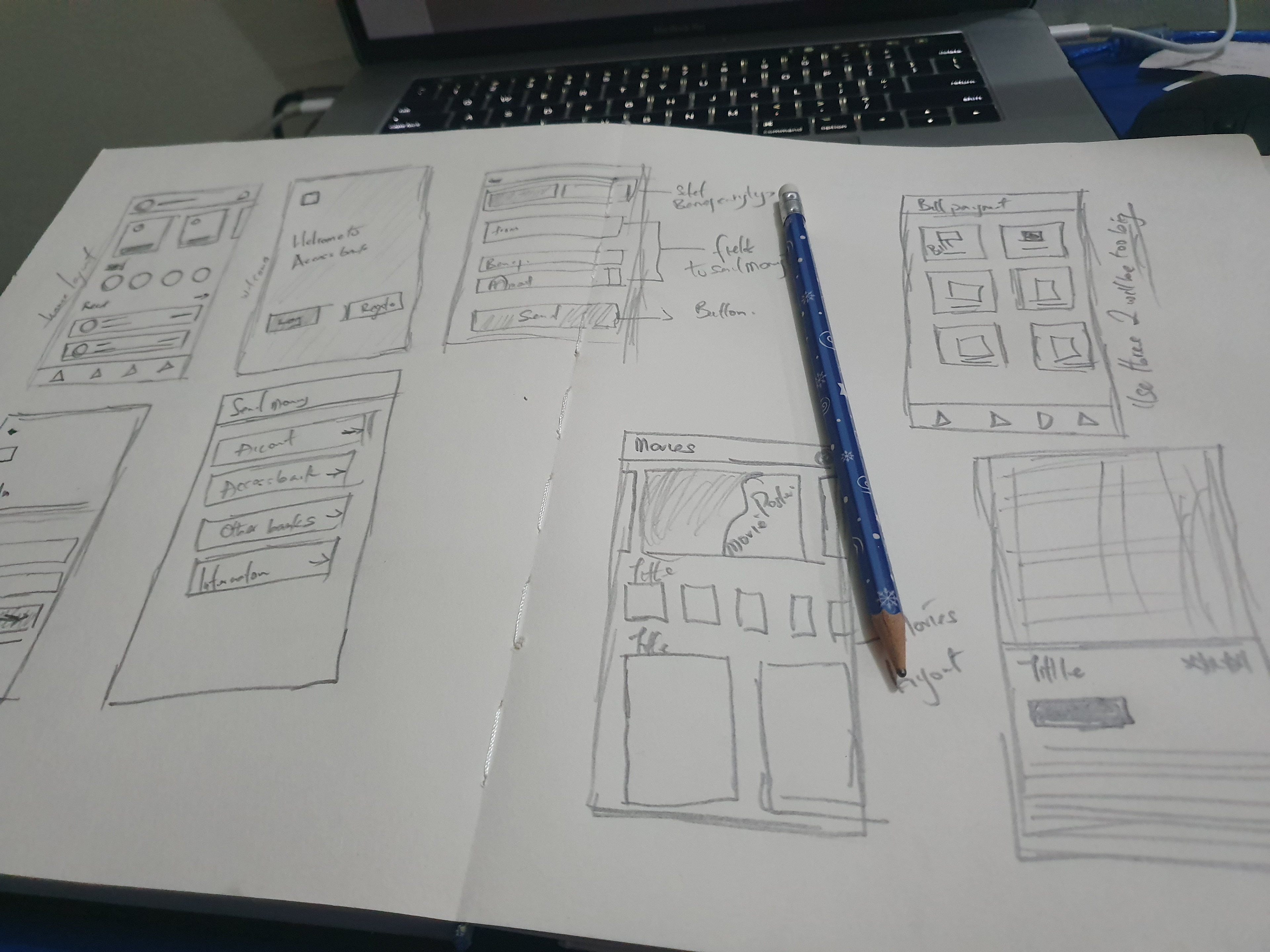
Rough sketches to validate my ideas
Just to confirm the ideas I had sketched, I proceeded to show it to users while explaining my idea for the app and also getting feedback. The paper prototype consisted of the Login screen, Accounts page, Make transfer, Bill Payment page, More menu. These major screens were selected to validate the information architecture.
Wireframe (low fidelity prototype)
I created a low-fi design to represent the skeletal framework of the app. I focused on the functionality using majorly, shapes. This allows me to quickly test ideas without diving into the details of the design
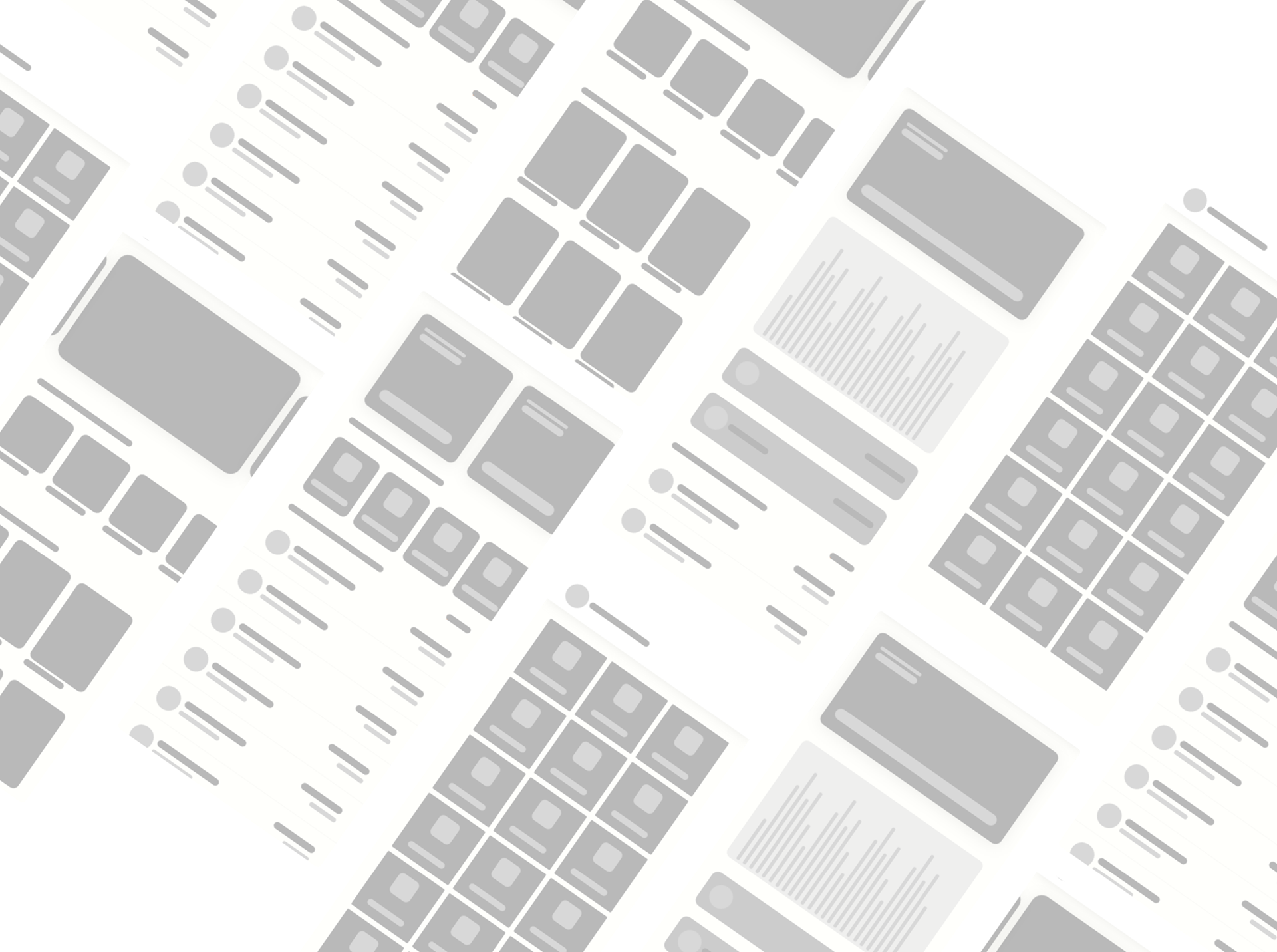
Low fidelity structural prototypes
Defining the solutions
With the pain points, I will be explaining my ideas to create a solution for the App one after the other
Navigation system
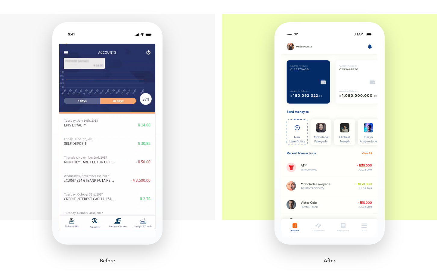
The current app makes use of two navigation types; the hamburger menu and the Bottom nav menu style. I changed this style and made it just the bottom nav style where the basic sections are easily accessible (Accounts, Bill Payment, Make Transfer, More menu).

Accounts/Home page
I redesigned the accounts screen totally. Here, I used cards to signify different accounts a customer has in the bank. Also, I added a quick payment to frequent beneficiaries(this is to reduce the number of steps to frequent beneficiaries). The account summaries are also provided and a user can view more than 30days of transactions as opposing what the app currently provides.
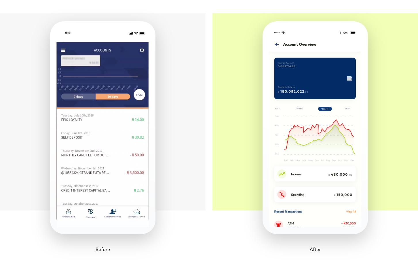
Account Overview
I created an account overview page where users are able to see a summary of the account transactions over a period of time. This creates more insights into a user’s spending and income records over a period of time. It also shows the recent transactions made on the account.
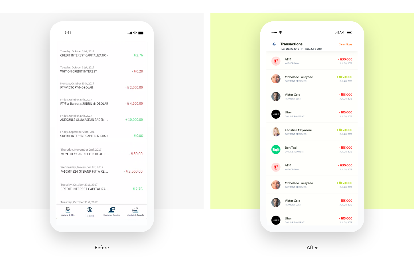
Transactions
The current bank app only provides transactions based on recent transactions and doesn’t have a robust history system. On the account page, I created a transaction section which shows just recent transactions, however, lets a user view all transactions on the account by clicking the “view all’’ button. This directs the user to the transaction page and allows such users to filter transactions based on the date. Also, summaries of transactions are presented to users when a particular transaction is selected.
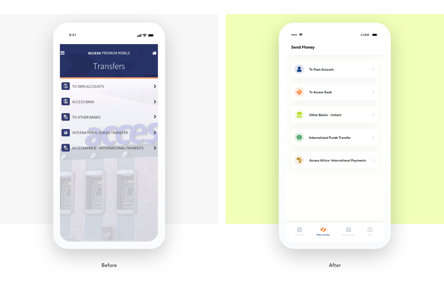
Transfer Page
The transfer page was redesigned to be more appealing and intuitive. The current method deployed to the current app requires you to; select the transfer type(Access bank) >> Select account to debit from >> type account or choose beneficiary >>> Type amount and Enter pin.
So to make the experience simpler, I proposed : Select Account type>>> Choose Beneficiary type(existing or New) Select Account to be debited >>> enter amount >>>send>>>Enter pin to confirm transaction>>> Show receipts.
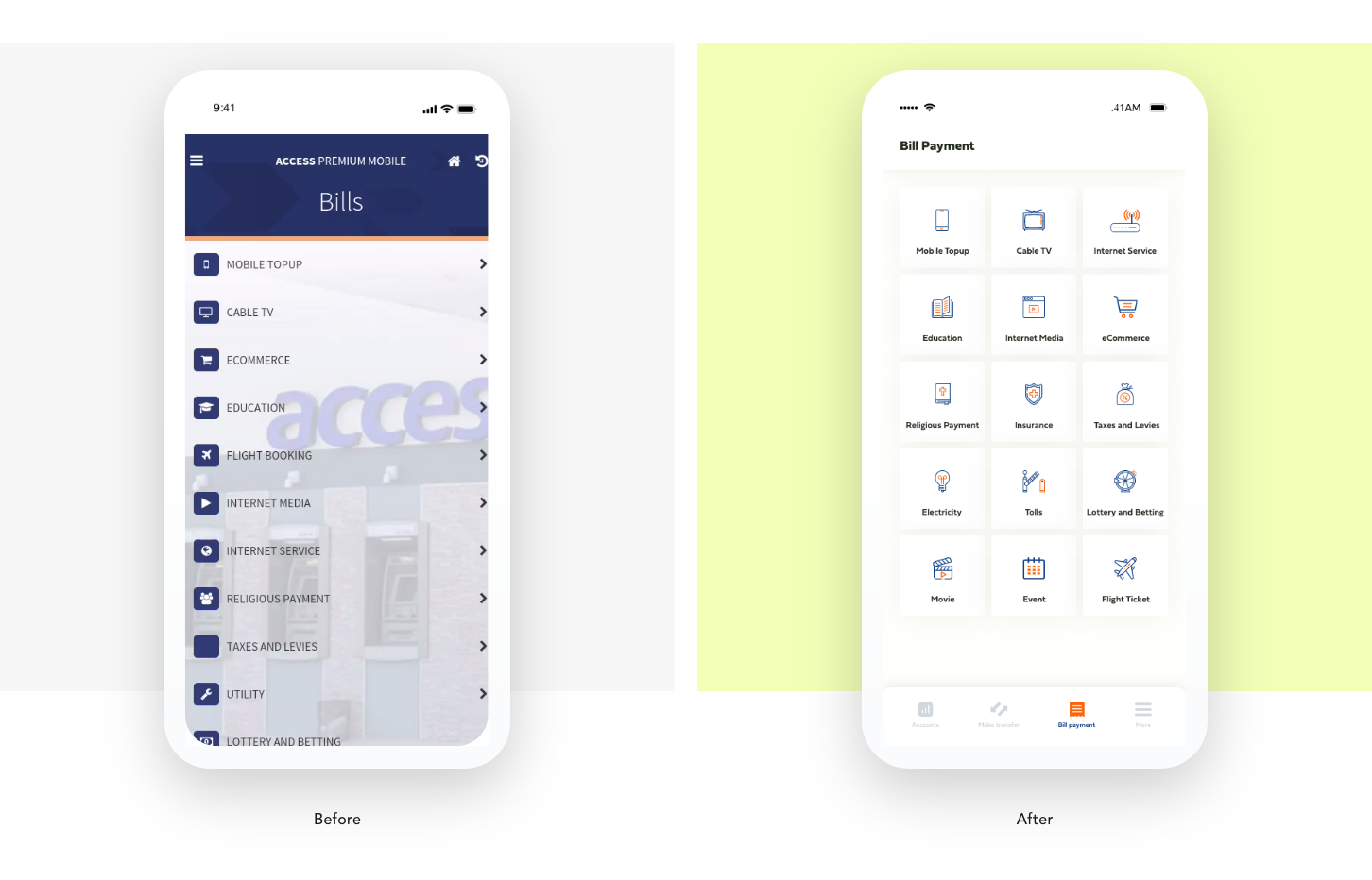
Bill Payment Page
A revamp of the Bill payment page to accommodate the new design style was necessary. To avoid scrolling on the bill payment page, the different types of bills were arranged in a 3 column style where almost all the payment options are shown at first glance and the users can scan through easily with related icons depicting the Payment Option.
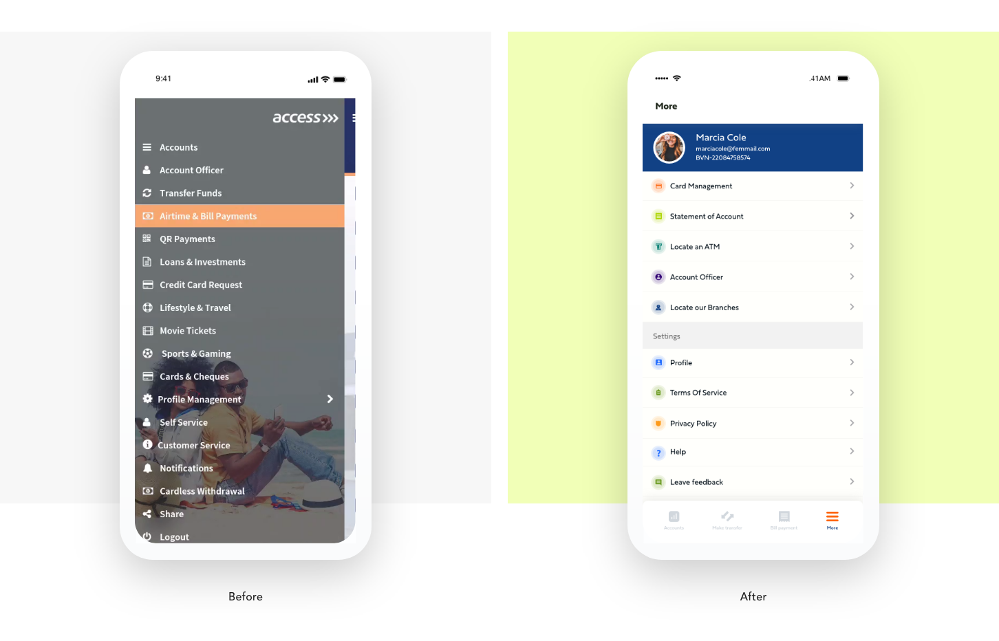
More Page
The more section was designed to accommodate all the other features of the app that are not usually needed (secondary functions), Including, statement of account, Card management Locating ATM galleries, and Branches Account officers, e.t.c.
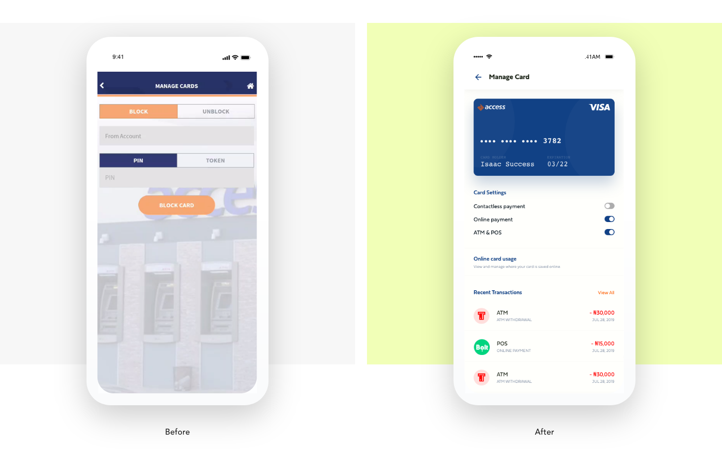
Card Management
This section was redesigned not only to block cards as the current app does but to also manage card usage. Furthermore, I introduced “virtual cards”, as some users suggested that they would like a virtual card that can easily be deleted, instead of having their main debit card on all platforms. Each card can be viewed and the activities on the cards can be reviewed to suit a user.
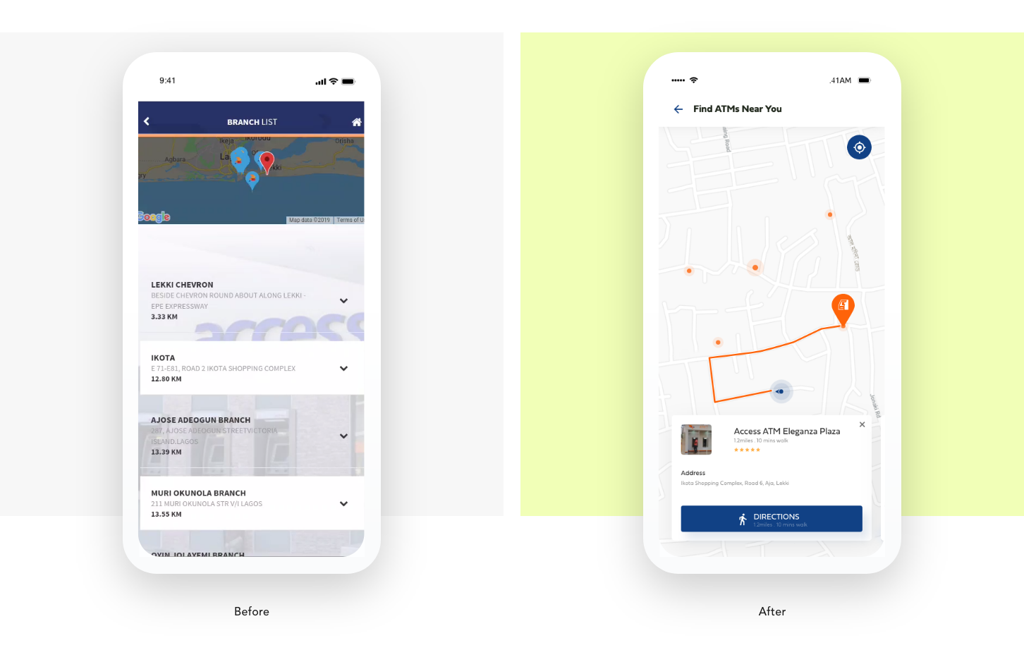
Locate ATMs and Branch Screens
These pages were designed to look familiar. The screen was designed to function as google map currently functions so users can become familiar with the operation and not need to learn to use the feature.
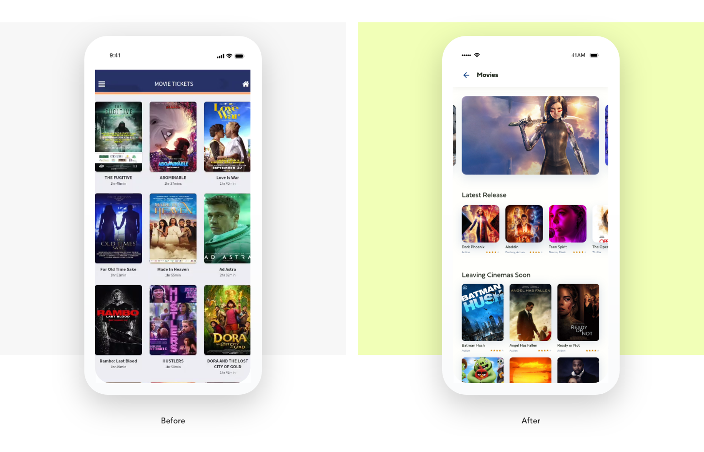
Movie Booking
Part of the bill payment section is an option to book a movie. I redesigned this experience creating a more robust experience for users. This change makes it easier for users to book movies and watch trailers.
Full Interactive Prototype
Using Adobe XD, it was easy for me to prototype the design. I needed it to be like a real app since I will be testing using my mobile phone. So I prototyped all the major screens and the basic interactions and micro interactions to give users the feel of a live app.
Please click here to view the prototype designed in AdobeXd where you can have a good feel of what was implemented.
Please click here to view the prototype designed in AdobeXd where you can have a good feel of what was implemented.
Usability testing
To know if my design has helped solve users issues as highlighted earlier, I invited users to test the prototype against the Current Access bank app giving specific tasks and objectives taking note of time used and problems faced(if any). The result was welcoming as positive feedback was received from every user and the time taken to do specific task reduced.
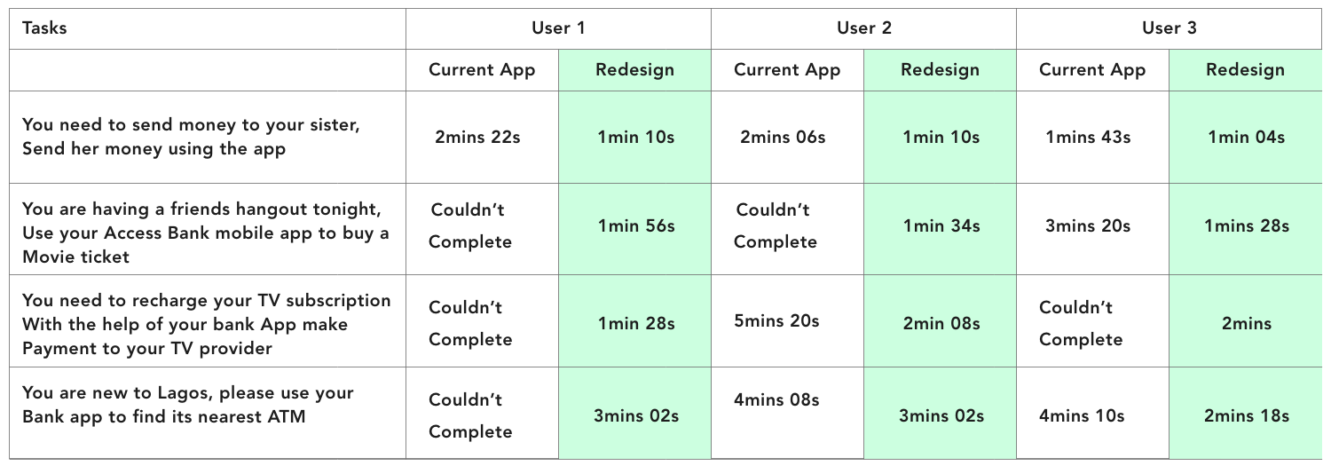
Ussbility Test Sheets
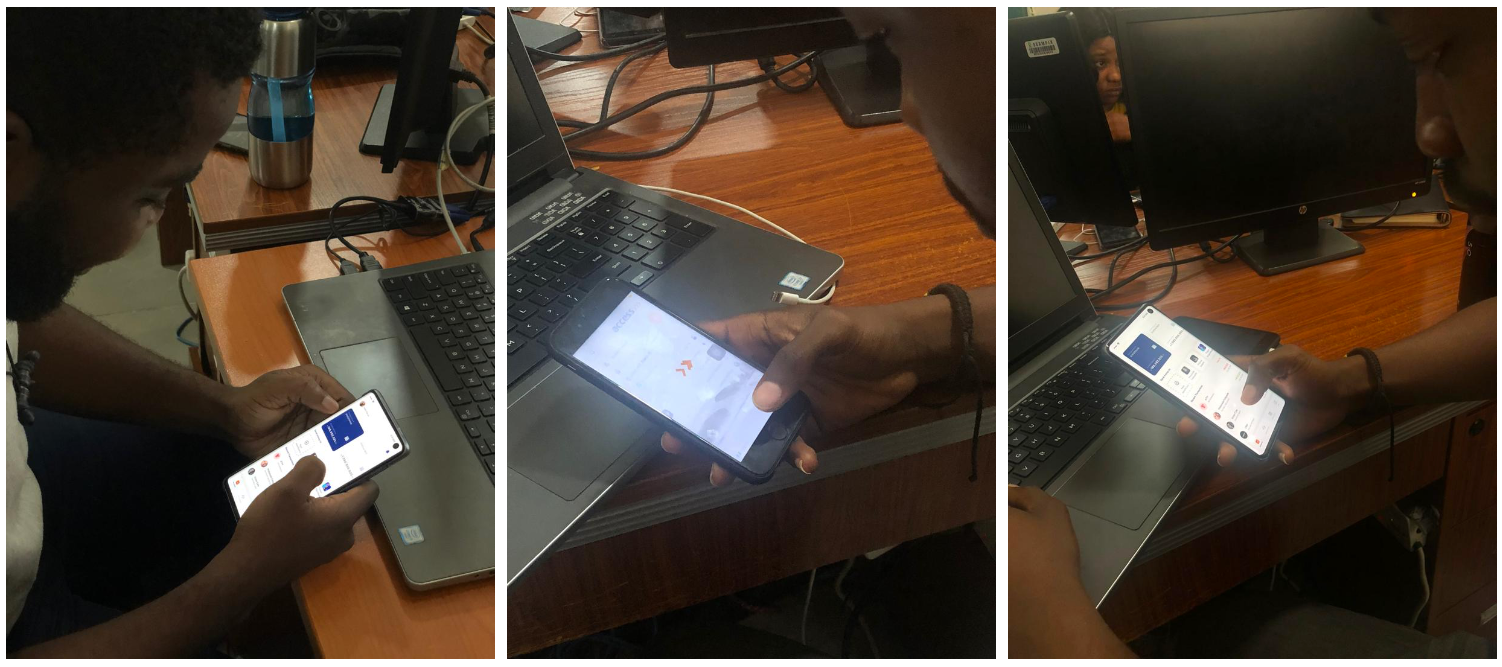
Sets of users during usability test
Conclusion
Designing this app was a rewarding and challenging journey. When I started this project, I merely wanted to try my hands on creating a better navigation routing for the app, however, as I got into the research phase I discovered more aspects that needed to have a better experience. Also, I have learned more about the general banking industry.
I have enjoyed my time working on this project and I would love to continue in my journey of understanding business and users’ needs to create great experiences for Apps.
Additionally, businesses like Access bank should be aware of user experience, and responding to user experience issues from customers will help to retain lots of customers. As for me I will wait till I get a better experience on the app.
Thanks you for reading this far!